Documentation
FilmFreeway is a multipage website/web application with a filterable database of international film
festivals, and a film-maker project submission portal.
Due to the specificity of the user requirements, there are unlikely to be many indirect competitors,
rather
a number of direct competitors (Nunes and Pratt, 76).
There are a number of film festival submission portals in addition to FilmFreeway, such as Withoutabox,
Reelport, Shortfilmdepot, Clickforfestivals, Festhome, Movibeta, Uptofest, Filmfestivallife and Filmfestplatform
(Review: 10 Platforms for Online Submissions, 2017) to name some of the most popular. It would be helpful when
redesigning the site, or appraising it to test the design and UX of these sites.
Users
I have identified a number of personae or archetype users;
- A film festival organiser/director.
- A filmmaker doing the rounds of this year’s film festivals.
- A new user, that doesn’t have a film project finished yet, but is investigating the process of
submitting
films to festivals, and what kind of festivals there are.
- A member of the public that is particularly interested in international film festivals.
it is important to understand some basic information about your users, such as age,
education, and background. What is their technical competency and familiarity with the technology you
are designing?
User Information
Before proceeding to sketch the UX Flow for this website, I considered the kinds of people likely to use the
website. This site would not be used by members of the general public, even those avid filmgoers that may use
Letterboxd or IMDb. This site, instead is for people involved in the filmmaking and festival industries. What
can we suppose from this? There would be a level of technical knowhow on both sides, as filmmakers would use
digital technologies to create and edit their work, and festivals would use online services to maintain their
online presence, publish updates and schedules and sell tickets for screenings. In addition, the majority of
users are coming to the site for relatively focussed reasons; they either have a project to submit or edit, or
they are looking for projects to screen.
It follows that while the site needs to follow good user interaction and visual communication principles, there
would likely be no need for basic wizards, induction and handholding. It is noted that while the project
submission form is lengthy, it is not a general internet user that will be completing it, but rather someone
that is an expert in their field, one that knows their project exhaustively and has specific motivations to
complete the process of submission.
applications have multiple “rooms” (in UX design we call them pages or modes), that contain
specific information or functionality.
Site Modes
This site has two primary modes; one for filmmakers submitting projects to festivals, and the other, which is
not covered in this document, for festivals to display their pertinent information and receive submissions. The
user signs up as a festival or filmmaker at the creation of their account, which establishes what site modes
they will encounter throughout their usage of the site.
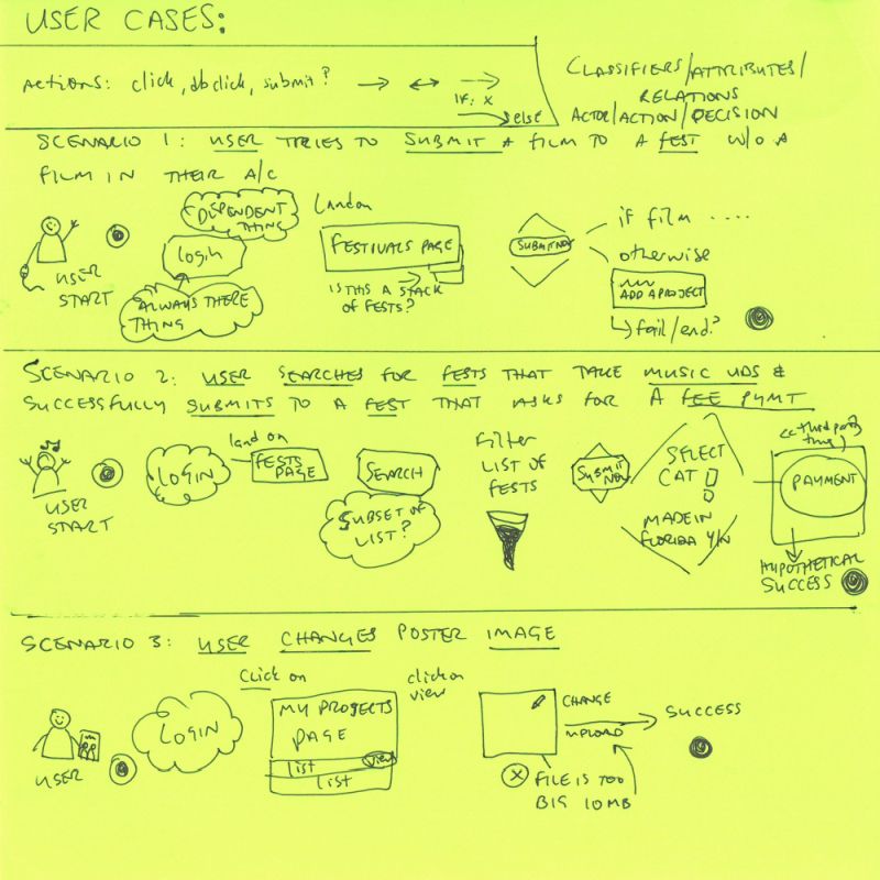
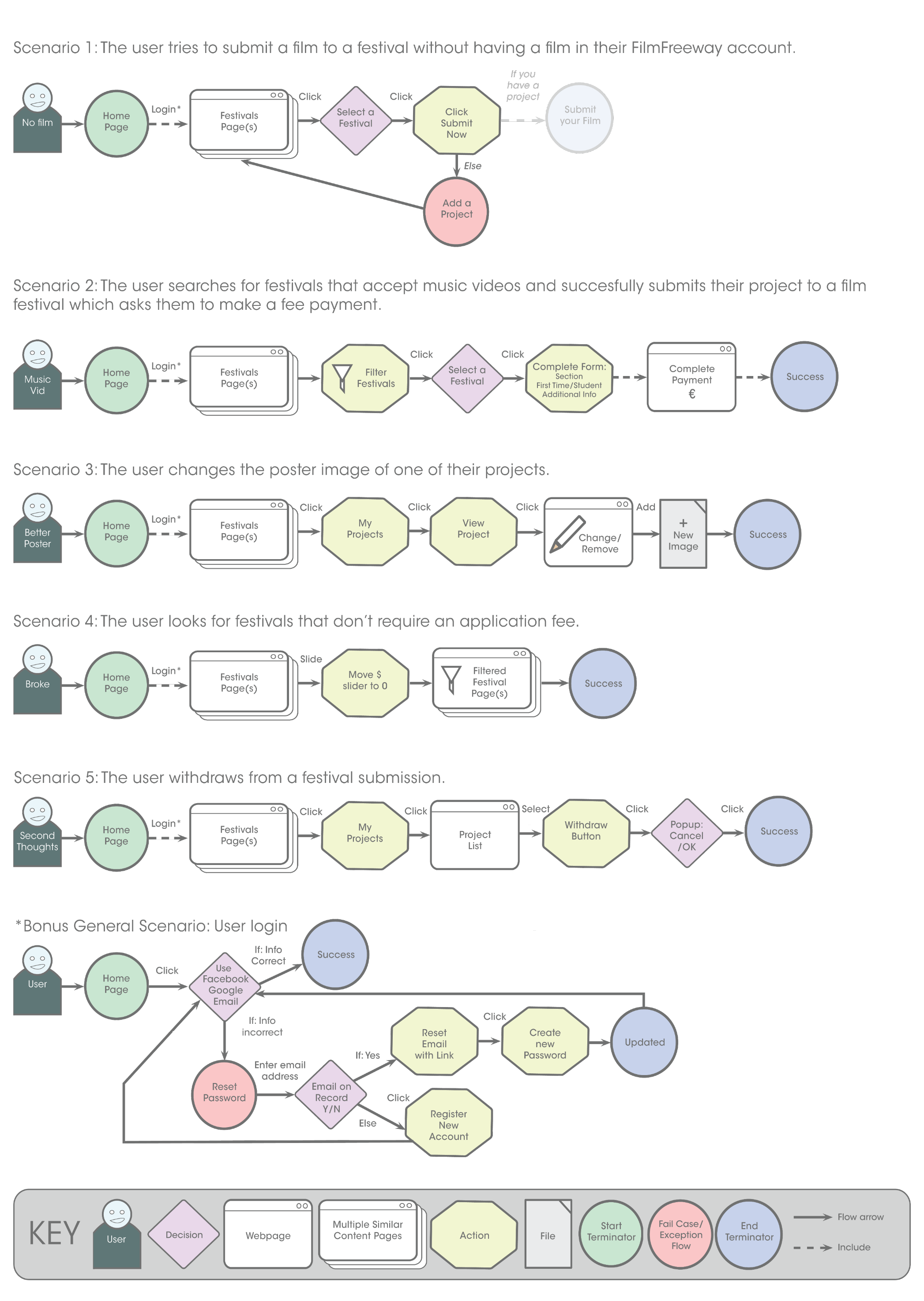
Use Case Scenarios (see UX flow chart for steps in each scenario)
- The user tries to submit a film to a festival without having a film in their FilmFreeway
account.
- The user searches for festivals that accept music videos and successfully submits their project to a
film festival which asks them to make a fee payment.
- The user changes the poster image of one of their projects.
- The user looks for festivals that don't require an application fee.
- The user withdraws from a festival submission.
As each of these scenarios are task-based, as opposed to exploratory or entertainment related, I thought it more
appropriate to have horizontal linear flows. These UX flows move from left to right, save only when the user
encounters a roadblock or exception flow. It was also unnecessary to utilise swim lanes (Cronenwett, section
2.4) as
there were few, if any parallel flows. I created each of the elements (figure 1) in Adobe XD; the user, termini
(outset, conclusion and exception flows or fail cases), actions, decisions, single webpages, page stacks to
indicate multiple pages of similarly formatted information, files, flow lines, and for this project, a dashed
contingent flow line indicating that a user could not proceed to the next step without completing the previous
action.

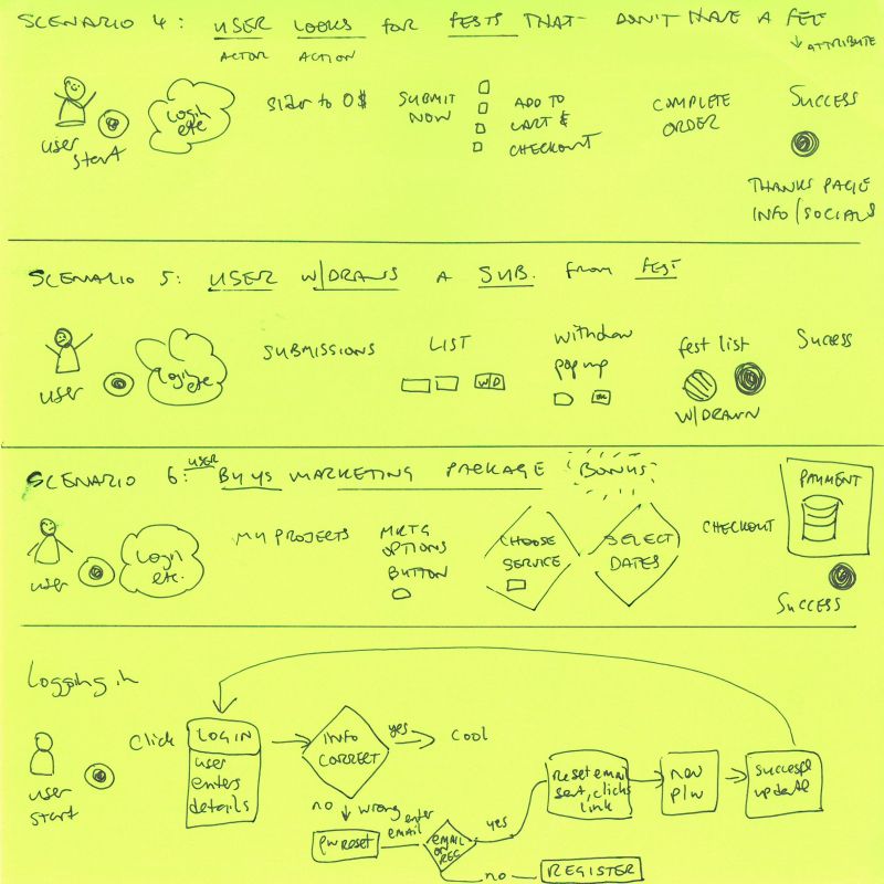
The requirement to log in occurred so frequently, that I created a separate User Flow diagram for this process.
I selected colours for the terminators and exception flows that in themselves indicate the stage of progress;
green for start/go, red for stop/error and blue for success. A diamond has typically been used in UX and UML for
decisions, and the octagon for actions is common, and also helps to visually differentiate actions and decisions
from each other and other elements. In scenario one, the user cannot submit a film to a film festival, as they
do not have a project added. I represented the project submission stages faded out, as they are inaccessible at
that time. Unlike the ability to login due to not having been registered or having forgotten credentials, which
is solvable for the user there and then, not having a project leads to a dead end. Finally I made a funnel and
pencil to specifically indicate the ability of the user to search and narrow down festival listings to a subset
and edit files.
Sources Cited
- Cronenwett, D. (2020, March 10). Flow and process diagrams - Interaction Design: Flow. LinkedIn.
Retrieved March 15, 2022, from linkedin.com
- Nunes, J., & Pratt, A. (2012). Interactive Design: An Introduction to the Theory and Application of
User-centered Design (1st Ed.). Rockport Publishers.
- Review: 10 platforms for online submissions. (2017, January 8). Festagent. Retrieved March 19, 2022,
from festagent.com
